
Marketing and Branding Strategy: The Psychology of Color
The psychology of color as it relates to persuasion may be one of the most interesting aspects of marketing.
For businesses, the colors that are chosen to represent a brand are done very carefully. The strategic use of color can be used to enhance a customer’s mood and actions because of the psychological influence the color has on the viewer’s mind. Larger companies may invest heavily into branding research – particularly color – to target particular markets and provide a certain impression of their product to consumers. In this article, we’re going to take a look at color from the perspective of the blogger, or small business owner.
What Colors, Exactly?
When we speak of colors in this article we’re referring to the colors used in your company logo, or as the color theme to your website. Even social media sites such as Twitter allow you to choose your own color themes.
For small businesses and the independent blogger, branding color choice may be more of a personal preference or even an afterthought. We’ve gone ahead and composed a brief summary of colors in order to provide an overview for those who may not have the time, but are interested in the psychological impact that specific color designs can provide.
How Do Colors Influence People?
White and Grey – Associated with feelings or calm, balance, purity, cleanliness, and safety. Neutral greys can also symbolize feelings of sophistication, practicality, and solidarity. Too much grey may lead to feelings of nothingness and depression.
Yellow and Orange – Cheerful colors that promote optimism and cheerfulness. Yellow has been shown to trigger a sense of caution (think wet floor signs) and to make babies cry. These colors are commonly used to create a sense of anxiety that can draw in impulsive buyers and window shoppers. You’ll notice the yellow is difficult to read against the while background which can cause a noticeable amount of stress, particularly on the reader’s eyes.
Red – Creates a sense of urgency and youthfulness. Red is associated with physically stimulating the body, raising blood pressure, and encouraging appetite. Fast-food companies use generous amounts of red in hopes that customers will purchase more to eat and stay for shorter periods of time.
Green– Health, peacefulness, health, and nature. Used in stores to relax customers and for promoting environmental issues. Green has been shown to stimulate harmony in your brain and encourages a balance leading to decisiveness. You’ll see a lot of “eco-friendly” products using green. Starbucks is a popular company who hosts green as its primary color in hopes of providing a sense of calmness and tranquility to their coffee shops.
Purple – Wise and imaginative. Commonly associated with royalty, quality, and respect. Purple is commonly used to brand beauty and anti-aging products.
Blue – Strength and dependability. It’s associated with peace, tranquility, and reliability. Believed to stimulate productivity, it is the most common color used by conservative brands looking to promote trust in their products. You’ll see a lot of technological and IT companies using blue.
Black – Symbolizes luxury, authority, power, stability, and strength. Black is commonly used by high-end clothing brands and car manufacturers.
You can also refer to the handy infographic below:
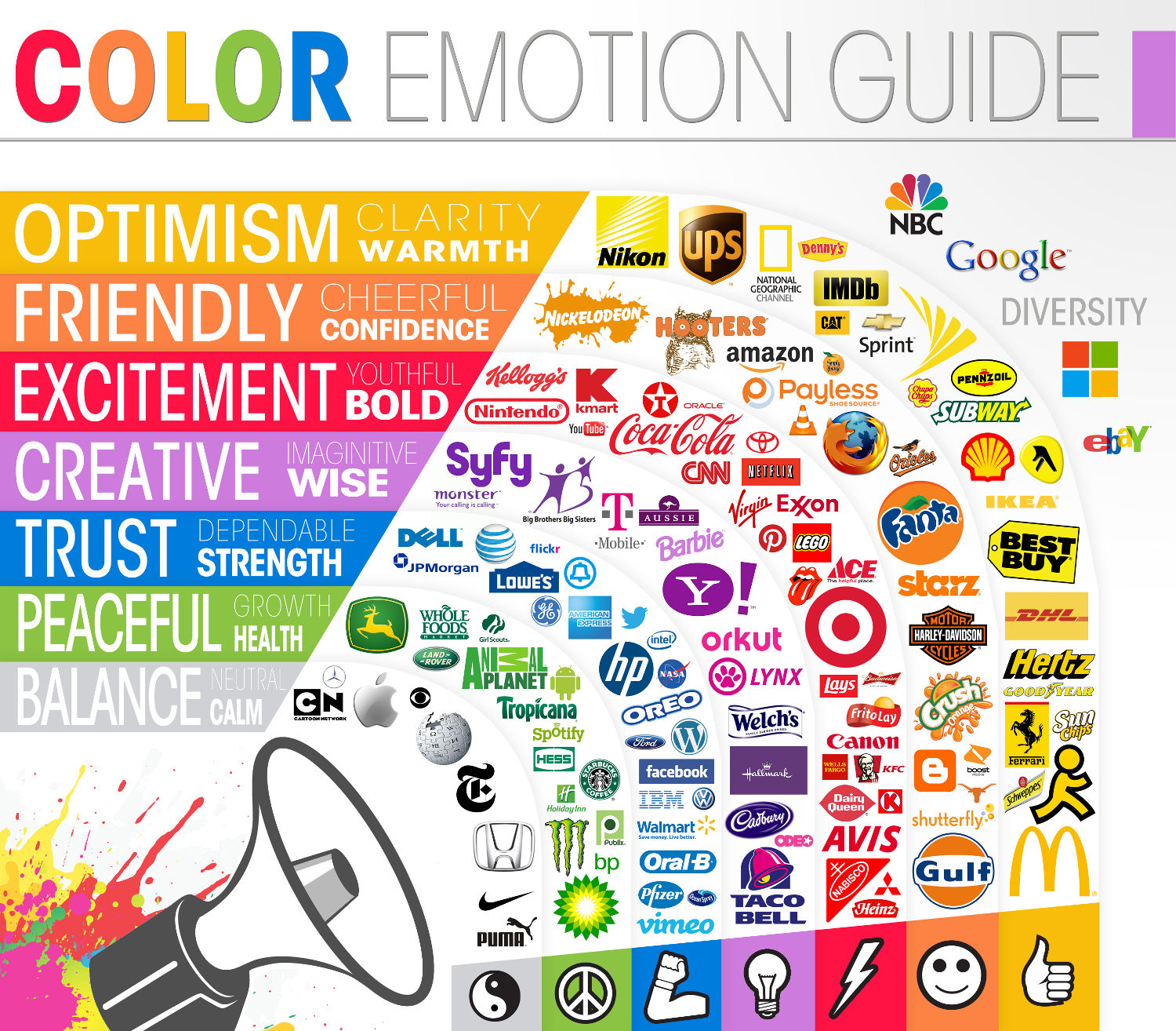
Source: The Logo Company
Properly Using Color Theory
It’s doubtful that you would only apply one color to your website or blog, and your not expected to have a degree in color theory, so what other colors do you use alongside your primary color?
Thankfully there are free tools available to help you once you’ve decided on your primary color. Many color palette tools and guides can be found using a quick search on Google. White is typically a safe bet, but it’s also important to manage the contrast between colors to reduce eyestrain and allow readers to focus their attention on specific terms. Vibrancy and bright colors can help dictate the emotional response users have to your design.
The color of your font is also important, and must be a color that is easy to read and does not “clash” with the other colors on the page. If you are using black text, you can try using color to differentiate between headlines and subtext, or to bring attention to a certain word in a paragraph. The best example possible are hyperlinks – we subconsciously assume that links are of a different color (and sometimes underlined) than the body text.
Conclusion
We hope we’ve spurred your interest into how incredible color can be when used for branding and marketing. There are countless resources available on the internet if you’d like to learn more. Keep in mind that the effect a color may have on a consumer is also dependent on personal experiences, and can not truly be translated into specific feelings. Even gender can be taken into consideration, where studies have been performed showing that when it comes to shades, tints, and hues, men seem to prefer bold colors while women prefer softer colors.
The colors you use in your marketing campaign may be the component that will initially grab the attention of the consumer. While there is no such thing as a right or wrong color, there are colors that may be more appropriate for the message that you may wish to impart.
How are you incorporating color into your branding and marketing efforts?