
What Is Responsive Design & How Can It Help?
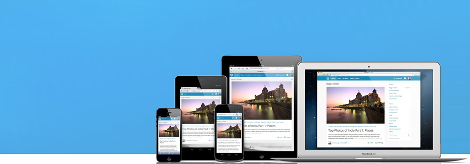
Responsive design has been a hot topic lately. With smartphones and tablets becoming the norm surfing the internet over desktops, having responsive design incorporated into your mobile site is more crucial than ever before. What exactly is responsive design? According to Mashable, responsive design is content on a website that becomes properly sized for the device the content is being viewed on. For example, if a customer is viewing a website on a smartphone or desktop, the content on the website will display properly for each device and adjust accordingly. There are many reasons why your website should be responsive design ready. One reason is better user experience when browsing the site. Besides the fact that the mobile revolution is here, it is best to have responsive design implemented now and not pay later down the road. The following blog discusses the benefits of having a responsive website.
Mobile Revolution Is Here!
The talk of mobile devices taking over personal computers, such as desktops, is here. Business insider stated that 677 million smartphones were sold last year. Followed by tablets having shipped 122 million units by last year. What does this mean for you? Simple, having a mobile presence now is more imperative than ever before. Take this example. Two families are running local bakery shops in the same city. The first website has a responsive designed implemented. If a mobile user is looking around the responsive design site, chances are the customer would continue forward with her experience, because it is pleasant, fast, and efficient. While the other family’s bakery website does not have a responsive design and the mobile user has to pinch and zoom every time to perform a required action. Which website do you think the mobile user will prefer next time she needs to place an order?
Accessibility, Reach Customers Anytime, Anywhere
One question we ask customers when developing mobile responsive sites for them is, what is the furthest your smartphone has been from you? Most answer within an arm’s reach. Why is this question relevant? Besides the fact we as consumers are obsessed with checking social media accounts, surfing the net while in a long line, or playing a quick game, mobile users have become dependent on their device. We stress that lots of customers are looking for quick information while on their phone or tablet and having your website optimized for mobile presence during anytime of the day helps customers access your content, anywhere, anytime.
Future Proof Your Website
Lots of websites are nowhere near optimized for mobile devices let alone able to handle a customers request when visiting the site. Responsive design performs the heavy lifting for you. For example, none of the URLs on the website have to change, which is a great for search optimization. Having a consistent link structure only helps with your ranking and allows search engines to crawl, technically, the same website. The only difference is the layout of the site on a mobile device is different versus being on a desktop. Responsive design protects companies now by being ahead of the curve and going forward when this type of design becomes the norm.
Having a mobile responsive designed site is so crucial nowadays because this is where a great number of users will first see your site. Therefore, your mobile presence is where initial perceptions and opinions will be formed and, if played correctly, it is also where a lot of business will be made. If you don’t have a site optimized for mobile, your customers may look elsewhere.